The ideal neutral and go-to wall color for your house is considered to be grey for a very long time. Grey is shrewd, intelligent, and uncomplicated, but as fashions in color change, it is gradually losing popularity.
Instead of the somber, cool-toned greys that were common in houses during the noughties, homeowners are choosing to utilize lighter colors within the home that create a brighter and warmer vibe. Traditional neutrals with a more warming tone than grey, such as beige, soft cream, and caramel tones, are a popular foundation from which to create a complete and textured design.
Additionally, homeowners are rethinking what constitutes a neutral foundation as more vibrant and energizing tones take center stage in interior design trends.
According to Karen L. Williams, architect and designer of WILLIAM CRAIG Design, “I feel the potential opposition may be less about ‘grey’ and more about the undertone of it being cool or warm.” “Many greys have strong red or pink undertones that manifest as incredibly rich neutral wall colors,” the author said. Great White by Farrow and Ball is a neutral shade that may be grey, beige, or light pink.
light blues like F+B Blackened and Dimpse are virtually paler than light grey because they lean colder. I believe that giving wall paint some depth makes the surface more vibrant and creates the ideal canvas for the space.
We chat with knowledgeable interior designers to learn about their preferred paint colors in order to understand the new neutrals that are causing a stir in the design industry.
SANDY BEIGE
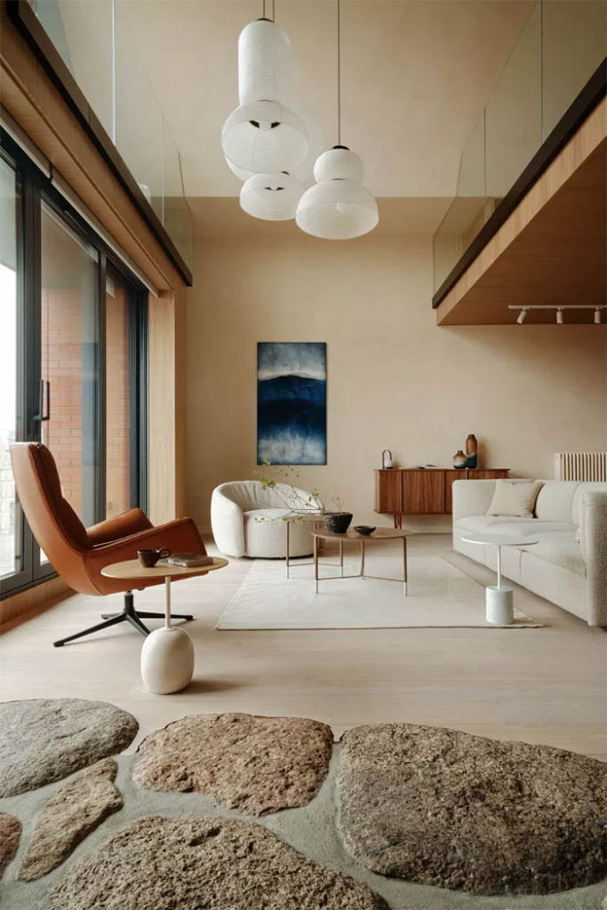
Beige is a trendy hue right now as homeowners choose something that infuses a space with more warmth and liveliness rather than the cold and sometimes harsh tones of grey. The undertones of beige may be pink, yellow, or orange tones, all of which give your home a soft golden tinge and serve as a wonderful base from which to introduce color in decorative splashes.
Beige colors from the brown family go well with rattan, wood, and jute, which have textures and features that homeowners are realizing are crucial for creating a pleasant and peaceful atmosphere in the house. It goes well with additional splashes of color and is really adaptable. Its tonal variety is its strongest point. One may get a lovely, earthy appearance by layering several intensities of the same hue.
Greys have been in style for a good ten years, but the pendulum is swinging back, according to Curated Nest interior designer Lina Galvao. “This results in generally warmer tones.” Warm whites, creams, and beige have been particularly popular with Gen Z, who often want a cozier atmosphere in their homes. We are seeing a lot of these hues in upholstery through boucles.
Designers Jordan Slocum and Barry Bordelon of Brooklyn-based interior design firm The Brownstone Boys concur that beige is “having a big moment.” Because beige has so many lovely tones and blends so well with other neutral tones, we love that it is so in right now.
According to Mary Dewar Dutallis of specialized design firm Studio Dewar, “A muted beige living room provides a subtle warmth and balances beautifully with natural stone and timber finishes, accented with crisp white trims.”
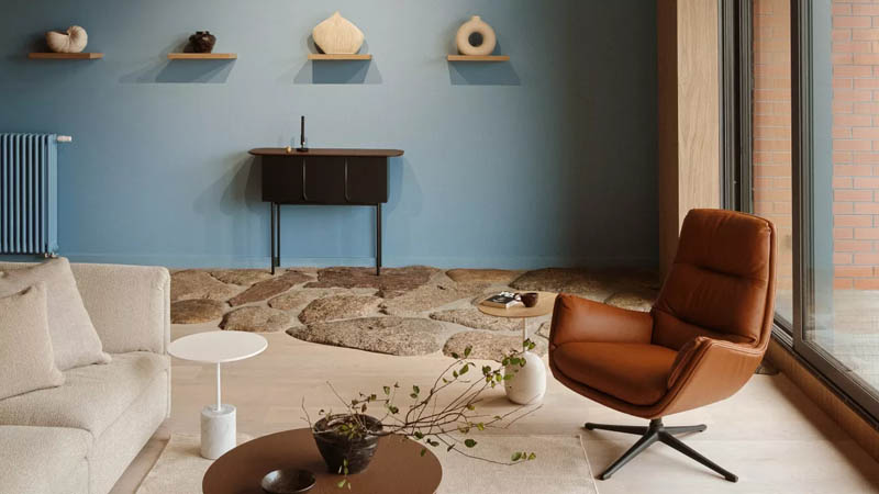
LIGHT BLUE
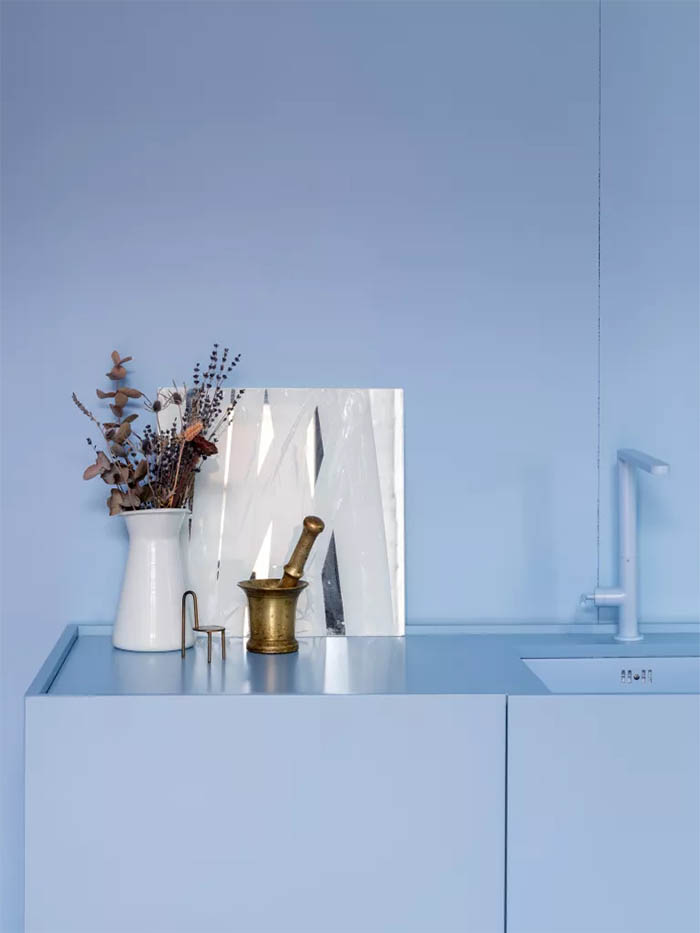
The use of blue throughout the house is something I really like. Blue has become more well-liked because it is calming, and quiet, and has associations with the outdoors and the seaside. This is partly because of the coastal grandma decor style, which was popularized by Reese Witherspoon’s powder blue kitchen.
For a relaxing, all-encompassing effect, crown molding and ceiling roses are painted in halls using a monotone color scheme. It adds a little color to the living space without becoming dominating. While blue has traditionally been shunned because of its chilly associations and used exclusively in bathrooms if at all, designers are now embracing a brighter, milder shade of blue that gives a space a positive atmosphere.
Designer Amy Lau(opens in new tab) states, “I have a very broad description of neutral paint.” Because there have been so many variations, anything may be referred to be neutral. The reason a certain hue becomes neutral in the sense that it serves as the foundation for a scheme is due to imbalances with other colors.
In this approach, a warm and vibrant blue may emphasize other colors in the space by being utilized monochromatically. Blue serves as the basis.
Studio Crosby chose a warm and uplifting hue of blue for this design.
PLASTER PINK
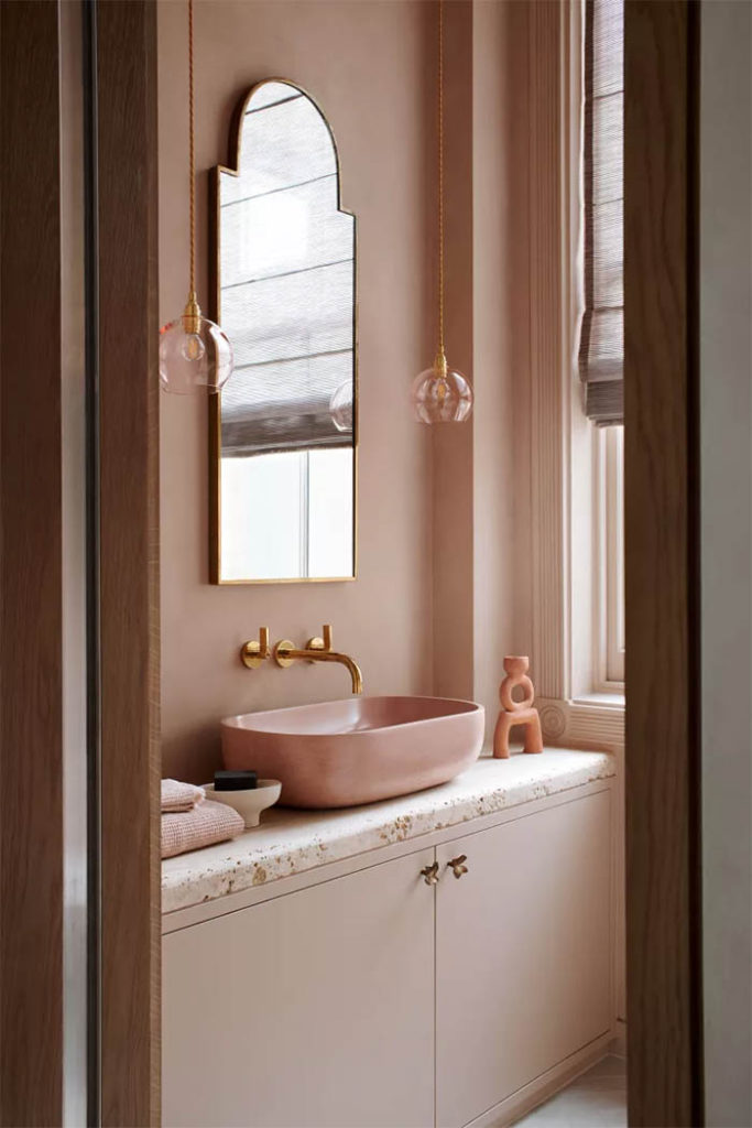
Another popular hue right now is pink, which has a reddish undertone that gives it vigor and warmth when exposed to the correct light. Pink gives a soft glow that spreads across a room, adding brightness and warmth, and is a wonderfully hospitable hue. To get pink into the neutral zone, use modest color schemes like recently applied plaster.
According to Martin Waller, creator of Andrew Martin and interior designer, “a color that is bang on trend for interiors, it calms, relaxes and comforts, helps us to escape from the stress of daily life, and blends into the background with ease.”
Interior designer Natalia Miyar (opens in new tab) claims that pink has always been one of her favorite colors to utilize. “I based the entire design of the living room in my London apartment on this color.” Since pink is more intriguing than beige or taupe, I like using it as a neutral, explains Natalia.
Emma Bestley, creative director and co-founder of paint company YesColours, adds: “Lighter colors like a soft peach or pale pink will lift the space, creating a loftier and airy feel.”